


App
A premium experience for financial professionals, creating value through personalisation and immediate access to the information that matters.
Bloomberg wanted to imagine a new future for its professional app. The challenge went far beyond a visual refresh: it meant completely rethinking its navigation and how users interacted with it to create a more meaningful, intuitive, and efficient experience.
For a tool its users pay a premium subscription for and depend on to make critical decisions, design needed to create real value. Understanding their needs and allowing each person to make the experience their own became the heart of the project.

Bloomberg Anywhere mobile experience

Widget system
Bloomberg Anywhere App
Bloomberg Professional—or Bloomberg Anywhere—lets business and finance professionals access their portfolios, information, and Bloomberg Terminal tools from anywhere.
More than moving the terminal experience to another device, the challenge was to reimagine what that experience could become when it was no longer tied to a stationary machine.

Smart dashboard personalisation
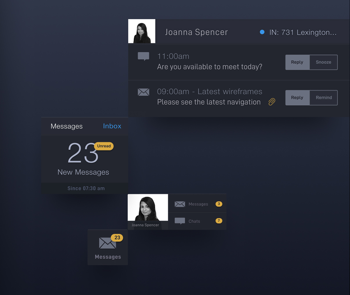
Smart dashboard modules
The goal was to create an experience worthy of a premium service, able to respond to the specific needs and priorities of every high-value user.
The answer was personalisation: no two experiences would be exactly alike. Each user could configure and prioritise information around their own interests, turning a vast amount of data into a personal, relevant experience accessible at a glance. It saves time, adds value, and makes the experience truly personal.

Icon system
The challenge was to create a premium mobile experience that let finance professionals access their world of information without staying tied to their large terminals. Ultimately, the proposition was freedom.
The work developed concepts, journeys, and interfaces able to contain highly complex information under exacting security standards. Solving that complexity in an elegant, intuitive way was also a lesson: constraints are often opportunities in disguise.
Through research, ideation, and extensive exploration, we developed a modular, grid-based system—an especially innovative approach in 2013—that could learn which information points each user consulted most and reorganise content accordingly.
The modules’ position and size could evolve with user behaviour, progressively prioritising what mattered most. Redesigned navigation, messaging, and information visualisation completed a more fluid, personal, and desirable experience.

Typographic efficiency exploration

Smart tile: intelligent personalisation